Relative Responsive Design
A relative responsive design optimized for larger screens (starting from a browser width of 1366px) and adjusting responsively for screen widths greater than 1366px. This design uses relative CSS units like %, em, and vw, including relative font sizes, to ensure flexibility and scalability across various screen sizes. It provides a more fluid and dynamic layout compared to traditional fixed-width designs.
Common Responsive Webpage Design
Common responsive design in different browser widths of the higher screen.
For Screen width 1600px & height 900px
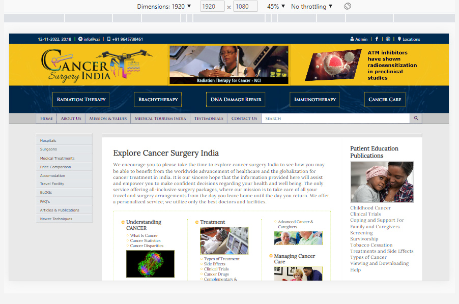
For Screen width 1920px & height 1080px
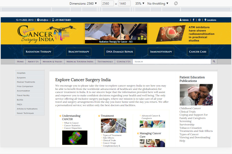
For Screen width 2560px & height 1440px
Relative Responsive Webpage Design
Compare the relative responsive design with the common responsive design in different browser widths of the higher screen.
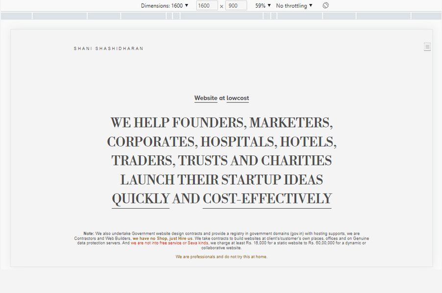
For Screen width 1600px & height 900px
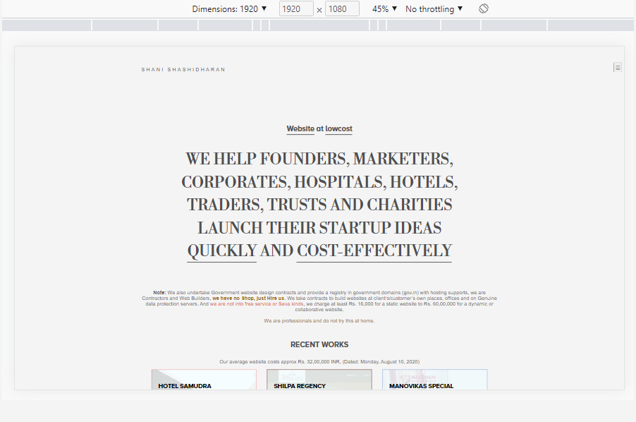
For Screen width 1920px & height 1080px
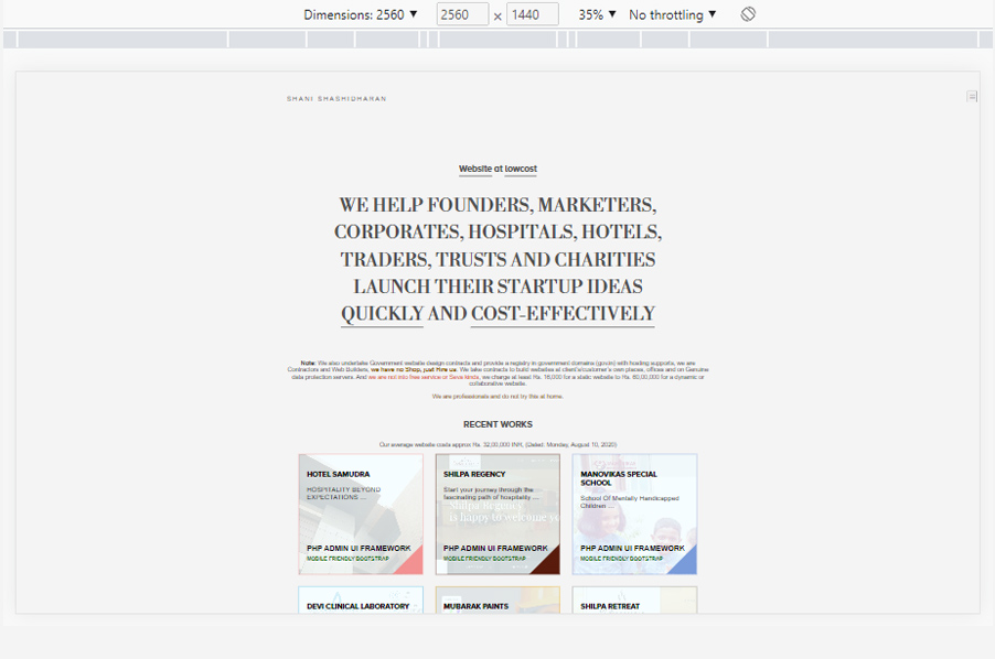
For Screen width 2560px & height 1440px
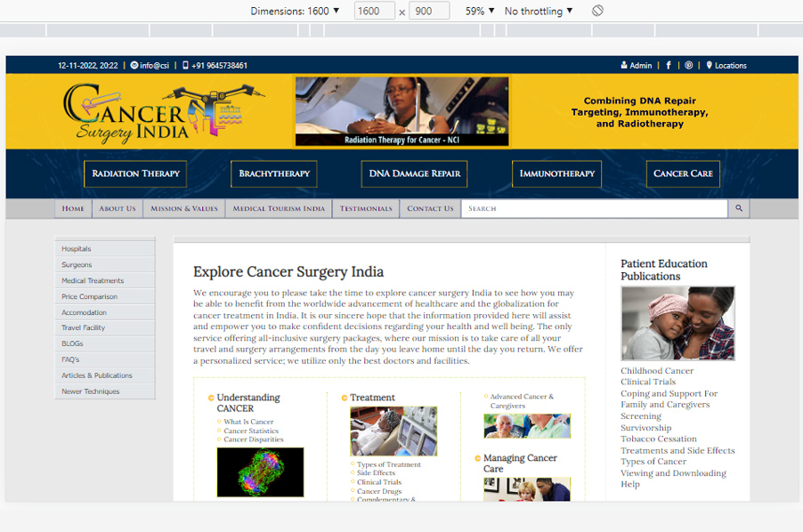
WATCH THE NEW RELATIVELY RESPONSIVE CANCER SURGERY INDIA HTML5 LAYOUT
This design is customized for desktop displays starting at 1366px and adapts smoothly for larger screens such as 1920x1080, 1440x900, 1536x864, 2560x1440, 1680x1050, 1792x1120, 1600x900, and others. It is tested on a variety of common higher-resolution screens and is optimized for mobile displays down to 240px. The layout is also tested and optimized for tablet displays such as the iPad, iPad Pro, iPad Air, and iPad Mini, adjusting for each device's resolution size.
By using relative CSS units like %, em, and vw—along with relative font sizes—this responsive design ensures optimal scalability across both larger screens (greater than 1366px) and smaller screens down to 240px. The relative font sizes ensure text remains readable and appropriately scaled, providing a consistent and user-friendly experience across all devices. This approach guarantees that the design remains flexible, visually appealing, and highly functional for a wide range of screen sizes and resolutions.
Web Design Features:
- Built with Bootstrap 4.4.1 for responsive design.
- Integrated jQuery 3.4.1 for interactive elements.
- Features a responsive canvas animation screen powered by CreateJs and HTML5 canvas action scripts from Adobe Animate CC.
Check and test Relative Responsive Webpage Design
Let's talk
Are you ready to do a documentary differently?
Reach out to me, shanishashidharan@gmail.com